Don't like:
- Not a fully tiled ensuite/ bathrooms. They can look unfinished. So back to drawing board and see our budget to fully tile at least the ensuite
- Small tiles especially on wet areas. Why do they spend nothing on area that's so much cheaper to upgrade?
- Extra glossy wood grain cabinets (scroll to see pic)
- Dark/ yellowish benchtop on bathroom and ensuite
- Large tiles
- Large shiny tiles
- Large shiny light coloured tiles :p
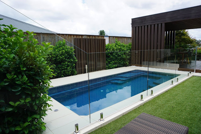
- Pool!
- Strategic use of mirrors. If you go to any display homes, look at where they put the mirrors - this is their tips on how to make the place feels bigger ;)
- Clean modern kitchen
Some random photos. I have about 300 photos but can't upload all of course.
 |
| Shiny! I like their mirror tricks along the bottom, making the place bigger |
 |
| Hubby likes this tile |
 |
| I like the round chairs... not very ergonomic though |
 |
| Landscaping ideas - but maybe not with loose stones |
 |
| Nice pendant lights |
 |
| An idea for not so plain toilet |
 |
| Tile colours |
 |
| Black kitchen - not my taste but nice to see example nevertheless |
 |
| Unique looking table :) |
 |
| Another wall ornament, making the place less empty |
 |
| More tile samples |
 |
| Kinda like this floor tiles |
 |
| Shiny wood pattern cabinets. Just not for me. |
 |
| Kitchen - Like this one. Nice and modern |
 |
| One display with pool on the backyard. Big YES |
 |
| Fully tiled pool with acrylic wall |
 |
| Nice neat landscaping next to pool |
 |
| The black benchtop and white silicon lining on basin - too apparent and not great |
 |
| Small fibreglass pool - the concrete ones above looks better I'd say |
No comments:
Post a Comment